Introduction
- Sometimes, when you conditionally format data colors on a visual it can be hard for report viewers to know on what basis the data is formatted.
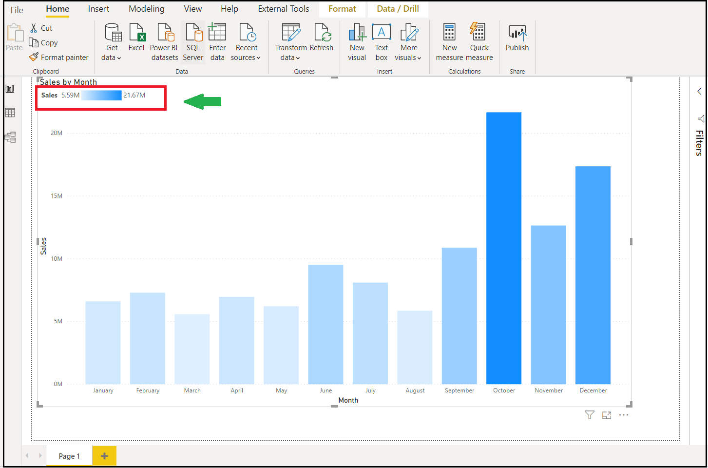
- With July 2020 update, you can now include a legend for data colors that have been conditionally formatted by color scale. This legend can help clarify the meaning of the colors in a visual to report viewers.
Conditionally Format The Data And Enable Gradient Legend:
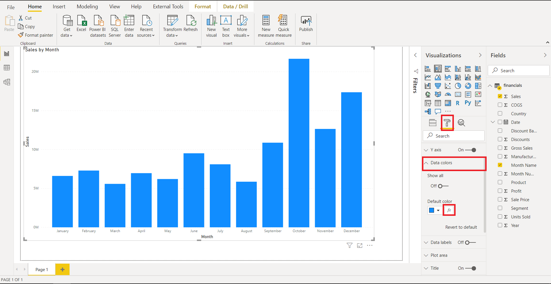
- Go to Data Colors from the formatting pane and open the conditional formatting dialog.

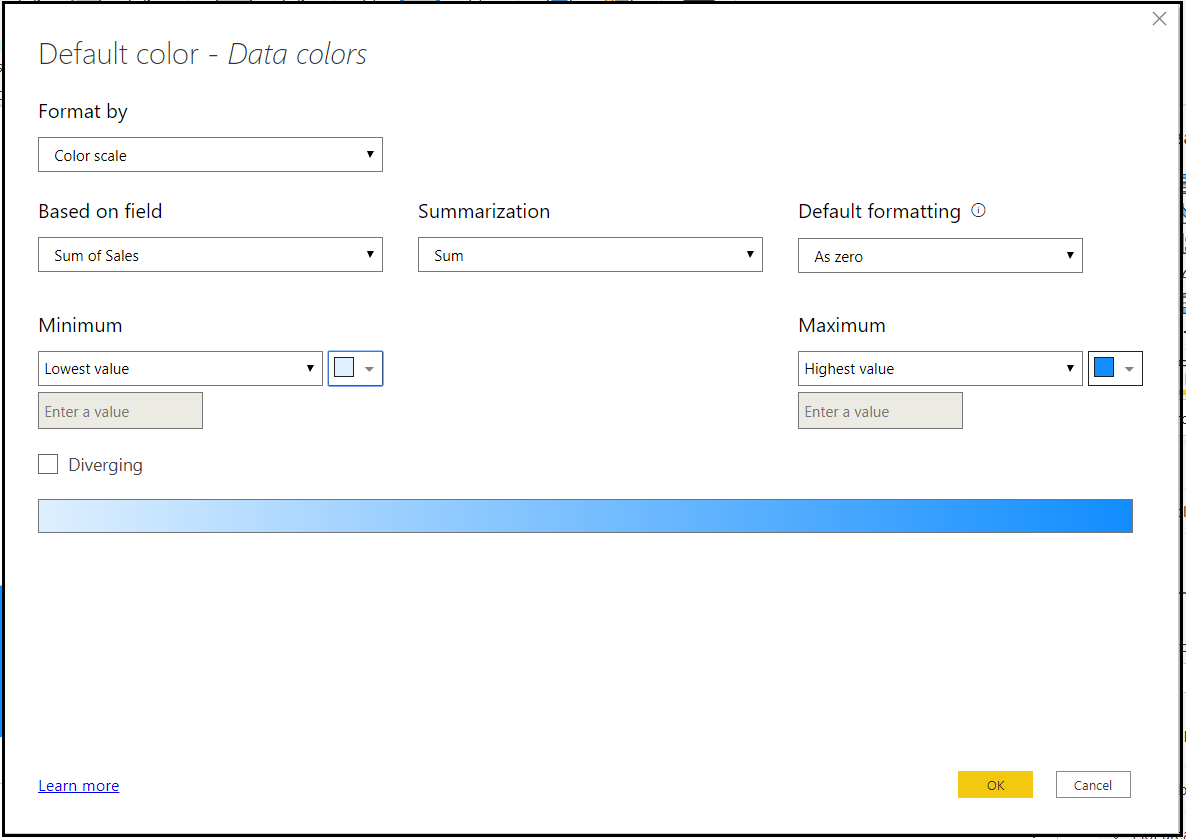
- Use this dialog to set a new rule to format your data along with a color scale:

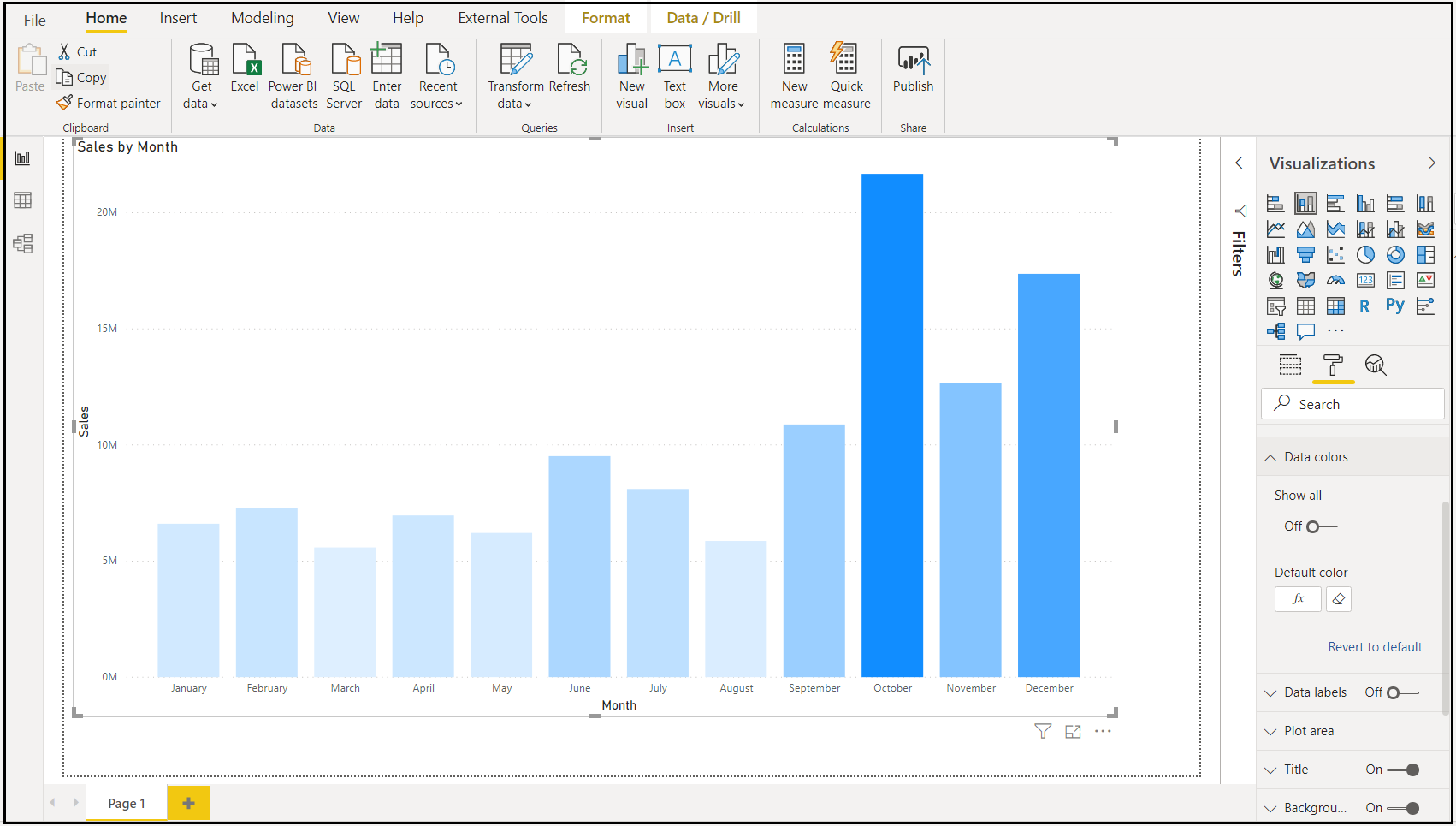
- You can now see that the data in the visual is now formatted by the colors according to the rules you have set in the conditional format dialog.

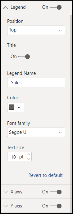
- This will enable the Legend card in the formatting pane. You can enable the gradient legend by toggling it on, then format the legend as desired.

- And now you can see the legend and know how the data in the visual is formatted.

Note: Please note that you cannot both conditionally format your data colors and split your data using the Legend field as well. This is because the Legend field already colors your data by category.
The gradient legend feature is enabled for bar, column, and scatter charts:
- Stacked bar chart
- Stacked column chart
- Clustered bar chart
- Clustered column chart
- 100% stacked bar chart
- 100% stacked column chart
- Scatter chart
